Rhino C.A.
A corporate website for an industrial inspection company, built from zero.
- Role
- Design, accessibility and visual direction
- Client
- Rhino C.A., industrial inspection, Venezuela
- Studio
- Artos Space (development and client communication)
- Live site
- rhino.com.ve
The Overview
The Project
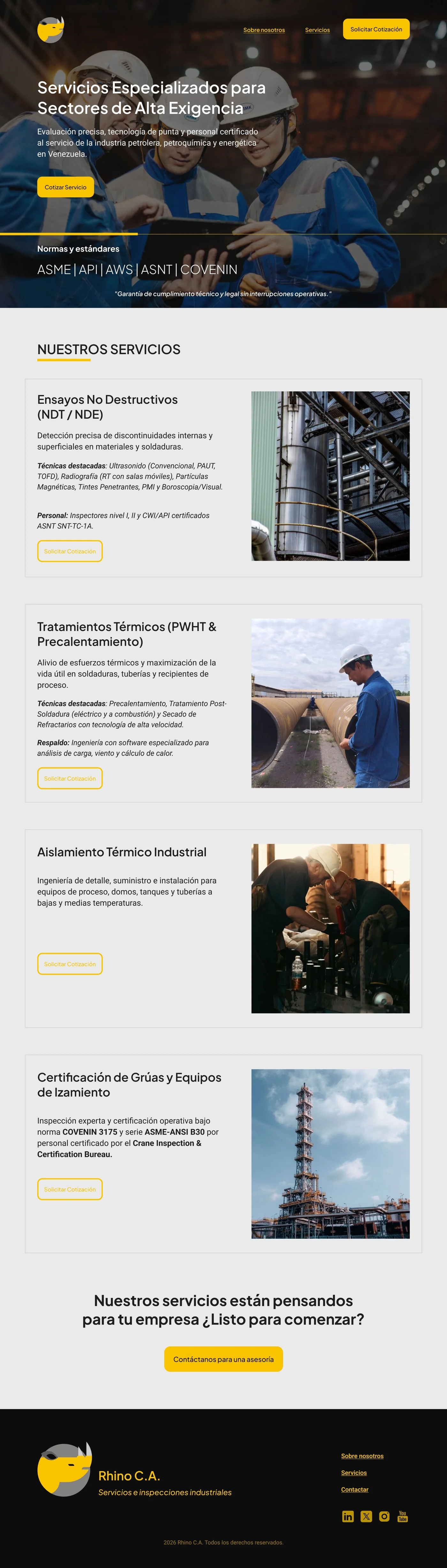
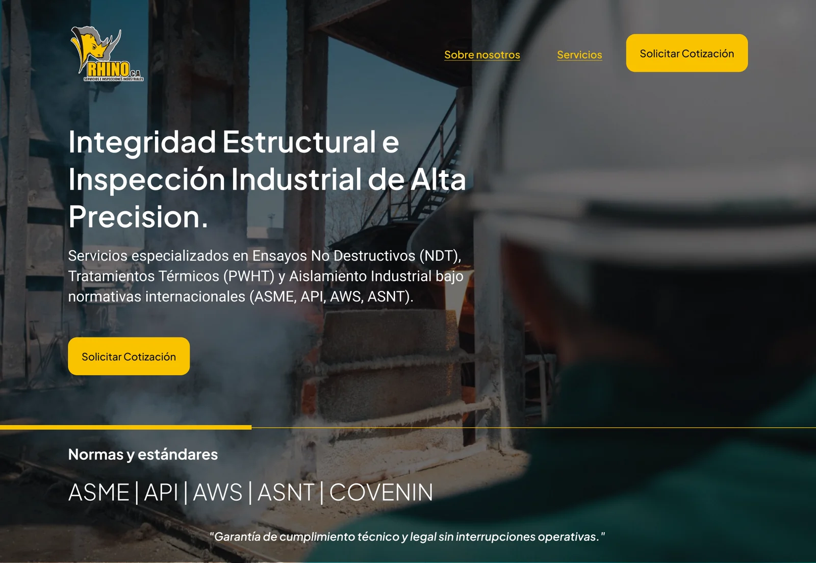
Rhino C.A. provides industrial inspection and thermal treatment services to the refining, petrochemical, gas, pipeline and steel sectors. They had no website: the site was designed and built from scratch.
The Problem
In a moment when everything is digital, the company had no digital image at all. Prospective clients had nowhere to learn what Rhino does, how it works or how to request a quote.
My Role
I was responsible for the design, the accessibility and the visual direction of the site.
The Team
Artos Space developed the full site and handled the conversations with the client before and after the design, sending regular reports so the relevant changes could be made along the way.
My Process
Starting from the company’s own material
I began by reading Rhino’s corporate brochure. The colors and logos came from there: the palette was defined by the brand, and my job was to make it work on the web.
Deciding what the site should say
Before designing anything, I defined what the site had to convey: safety, knowledge and work built on experience, so that a prospective client understands why Rhino will deliver what they need.
Visual direction
I led the visual direction of the whole site, taking inspiration from industrial company websites in the United States to find a language that feels serious and reliable for the refining, petrochemical, gas and steel sectors.
The Hardest Part: The Quote Request
I had never designed for an industrial company, and I knew a bare “Contact us” form (an email and a message box) would not work. A client who needs an inspection or a plant shutdown has a technical need, and the first thing the site asks for should show that Rhino understands it.
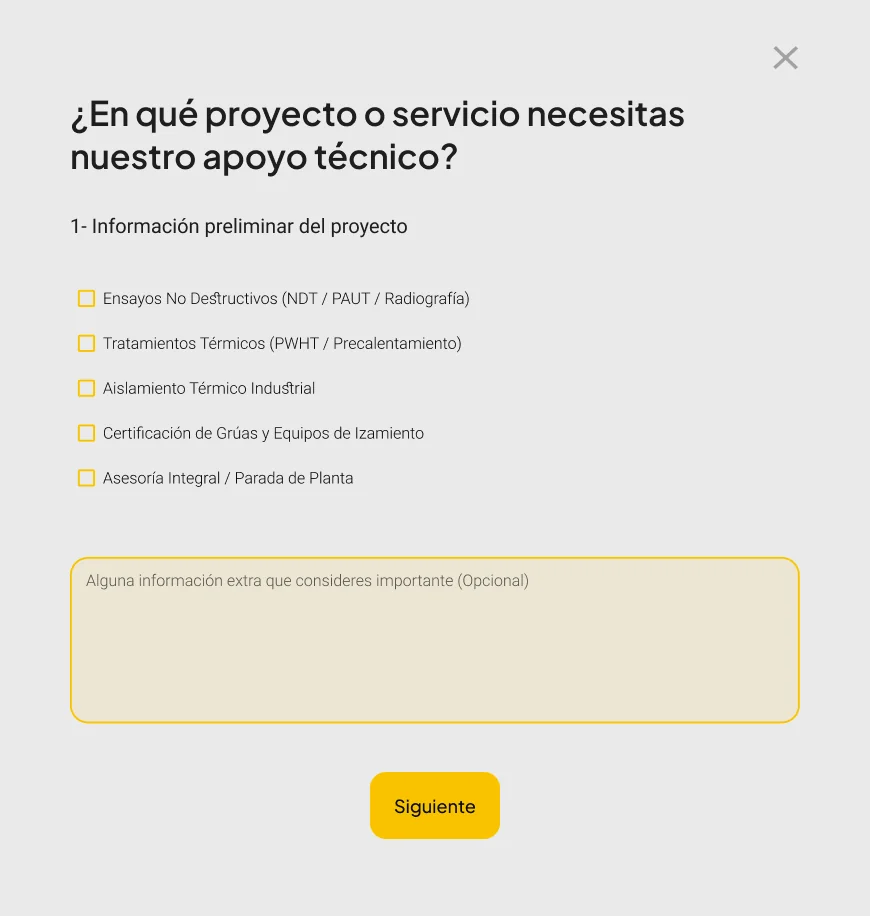
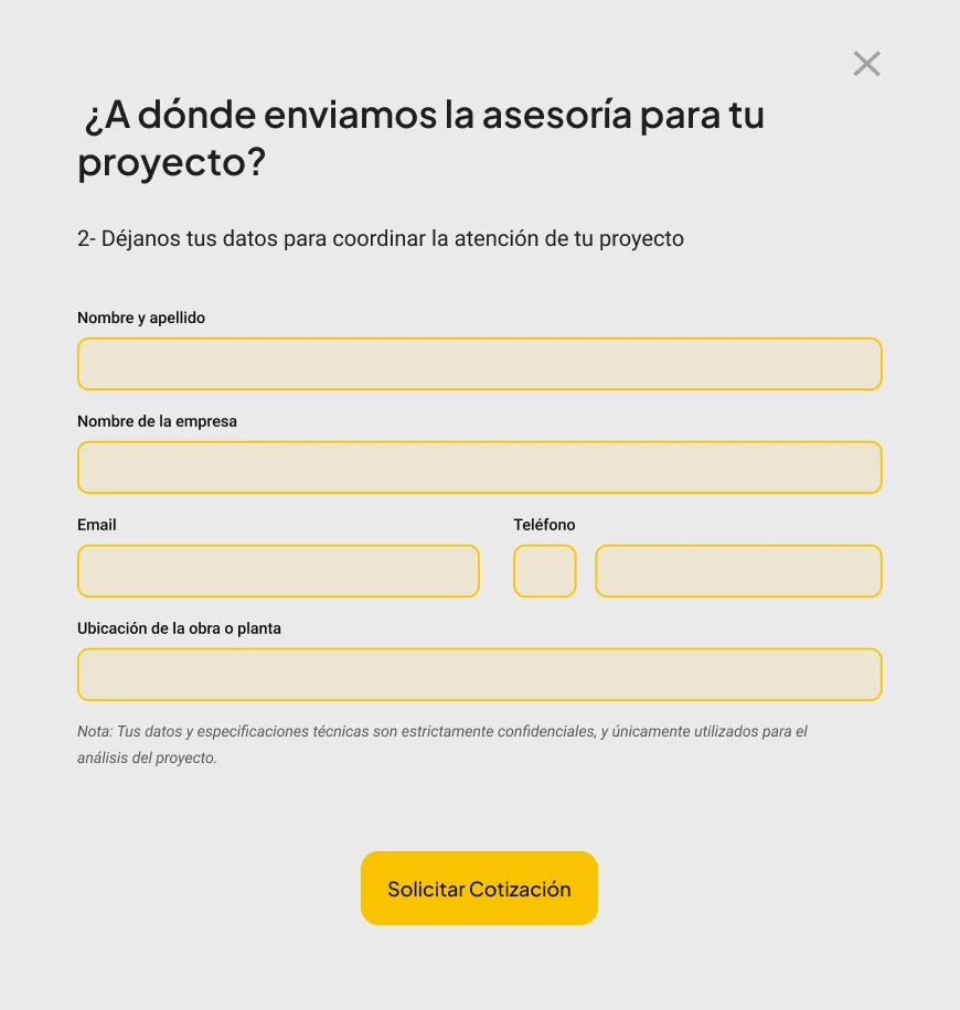
I put myself in the client’s place and researched what industrial clients look for before they trust a provider. The result is a short, guided pop-up in three steps.
1. Preliminary project information
The client picks the service they need: non-destructive testing, thermal treatments, industrial insulation, crane and lifting-equipment certification, or comprehensive advisory and plant shutdown. An optional field collects any extra information.
2. Contact details
Name, company, email, phone and the location of the site or plant, with a note that the technical specifications are confidential and used only to analyze the project.
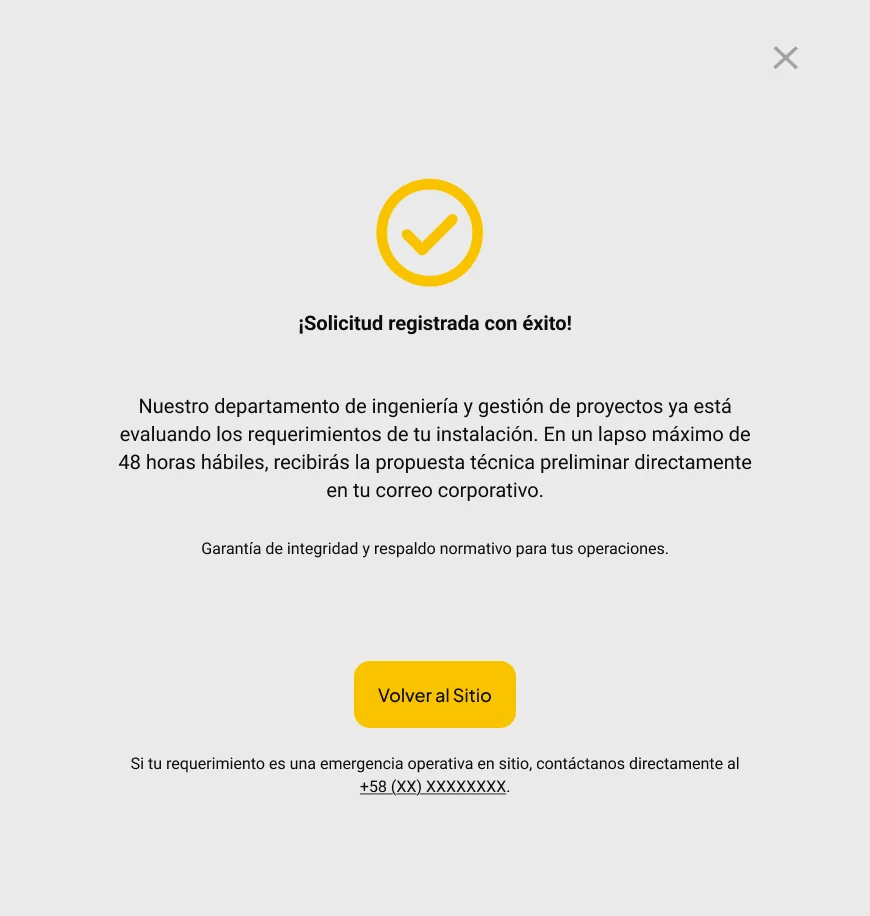
3. Confirmation
A clear confirmation sets expectations on response time and offers a direct phone line for operational emergencies.
A Brand-Led Visual System
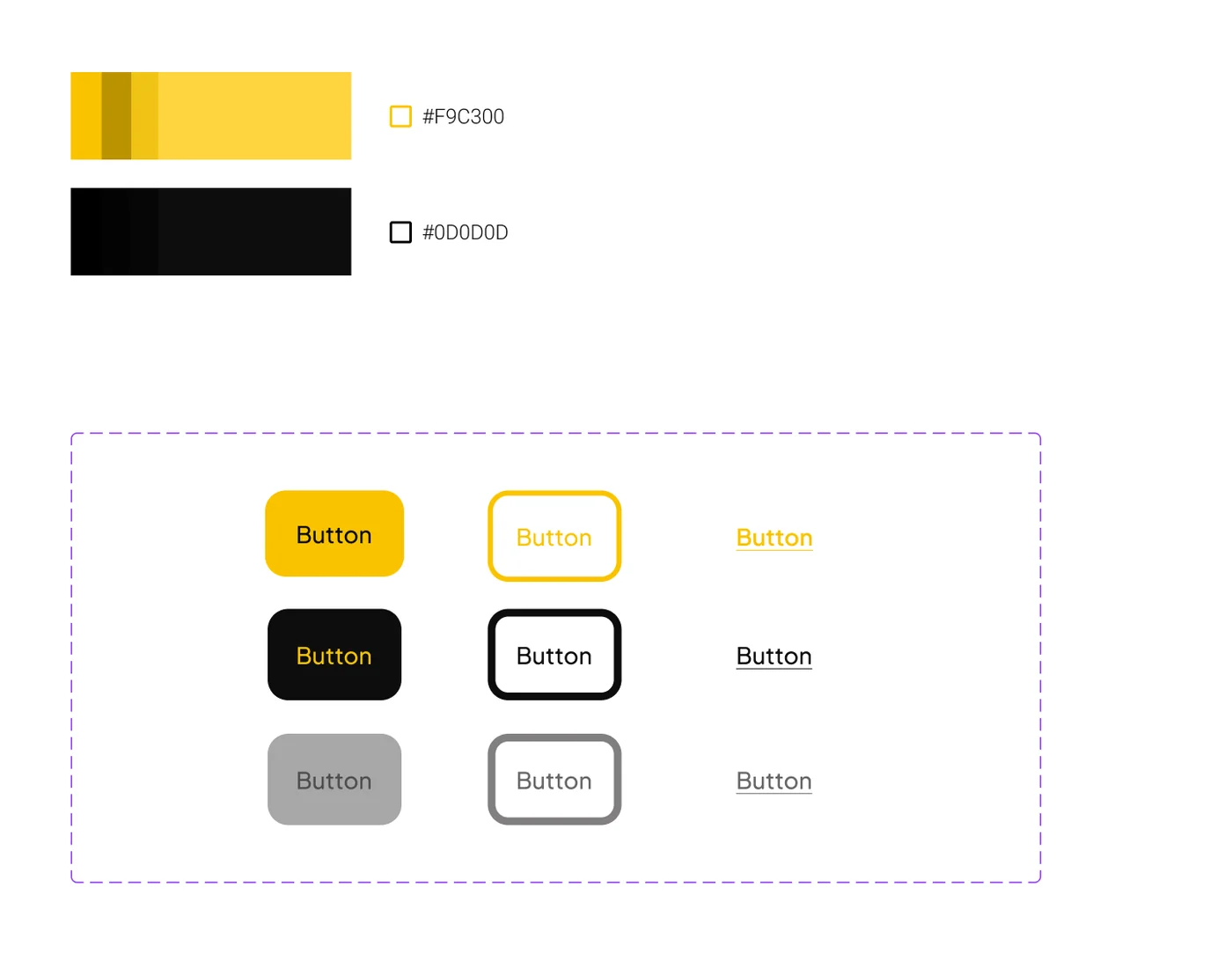
The palette came from Rhino’s own brand: a strong yellow and a near-black. Their pairing reads at a contrast ratio of 11.9:1 in either direction, so the primary buttons stay legible.
| Role | Color |
|---|---|
| Brand yellow | #F9C300 |
| Near-black | #0D0D0D |
Accessibility: From 86 to 91
Accessibility was part of my role from the start, and I audited the site with Lighthouse. The audit pointed to text and controls in the brand yellow placed on light backgrounds, where the contrast was too low to read comfortably.
I corrected those combinations, keeping the brand colors but changing how they are paired. After the changes, the site’s Lighthouse accessibility score went from 86 to 91.
Final Pages
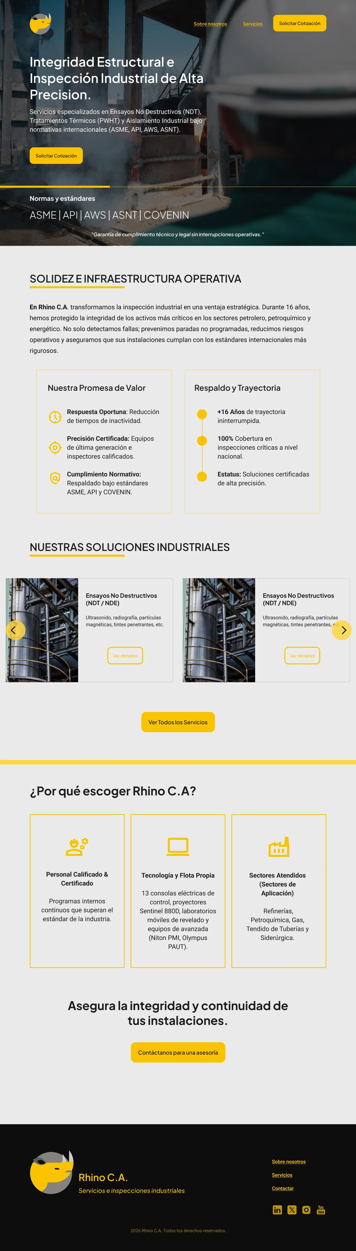
Home
Services